

Friday, March 20, 2009
Microsoft Tweaks Honeycomb UI
Posted by Darius Wey in "Pocket PC News" @ 02:20 AM
"While the layout remains the same and the icons are in the exact same place, they have been enlarged and the actual honeycomb outline (hexagons around each icon) is gone. Furthermore, scrolling up or down no longer means going all the way to the top or all the way to the bottom: the second the finger leaves the screen, scrolling will stop."
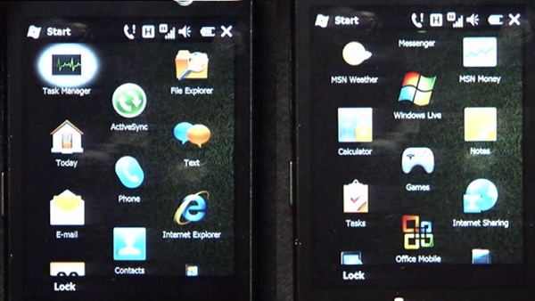
You're either going to love or hate the changes made to Windows Mobile 6.5's honeycomb UI. If you've forgotten what the previous version looked like, take a gander at our screenshot thread posted back in February. Now, looking at the image above, you'll notice that the latest version no longer sports hexagonal outlines, yet the hexagonal layout remains. It's a double-edged sword, because while visual clutter has been reduced, it becomes less apparent to uninformed users that these zigzagging rows actually represent a hexagonal layout, in addition to why it was adopted, prompting them to question whether such ocular trauma is really necessary.
That aside, Microsoft has made noticeable usability and performance tweaks to Windows Mobile 6.5 on the whole. It's definitely looking smoother and shinier than ever before.