Monday, March 2, 2009
Windows Mobile 6.5's Honeycomb Layout Explained
Posted by Darius Wey in "Pocket PC Talk" @ 12:45 AM
"Contrary to popular belief, the tip of human fingers is not squared, but in fact circle-shaped when depressed against a hard surface like a touchscreen. When you're space-constrained as you are in something like the applications menu - where there's a fine balance between how many icons can be displayed at one time and how easy it is to hit the icons, large circular hitareas makes it easier for users to touch the desired icons and avoid accidentally hitting nearby icons."
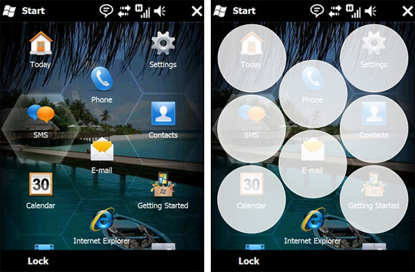
If you checked out our "Windows Mobile 6.5 Screen Shot Walk-Through" thread on the day of said OS' unveiling, you'd have a general idea of why Microsoft opted for a honeycomb layout over the conventional square grid layout. Long Zheng, over at istartedsomething.com, elaborates on this. But there are still skeptics out there, and if you're one of them, we'd love to hear from you. What aspect of the honeycomb layout do you truly dislike, and what would you prefer to see in its place?